
Reportstripe.com
Fix the contrast overlap on mobile hero text and replace vague CTA button copy like 'Get started' with clear account creation language.
4 issues · desktop and phone · read by gemini-3.6-flash
What to fix first.
4 evidence-backed- Call to action01Their words
Get started
The primary hero button text is vague and doesn't explicitly inform the user that they are creating an account.
Fervani's rewriteCreate free account
AI prompt to fix this issue
You are editing the landing page at https://stripe.com/

Fix one problem — call to action.

Current text on the page, verbatim:
"Get started"

What is wrong:
The primary hero button text is vague and doesn't explicitly inform the user that they are creating an account.

Replace it with:
"Create free account"

Rules:
- Find the quoted text in the page source and replace it.
- Keep the surrounding markup, classes, and layout intact unless the fix requires a change.
- If the quoted text appears more than once, update every instance.
- If you cannot find the quoted text, say so instead of guessing.
- Headline02Their words
Financial infrastructure to grow your revenue.
On mobile viewports, the visual gradient background bleeds directly behind the words 'frastructure' and 'revenue', creating severe contrast issues and hurting legibility.
Fervani's rewriteFinancial infrastructure to scale your revenue
AI prompt to fix this issue
You are editing the landing page at https://stripe.com/

Fix one problem — headline.

Current text on the page, verbatim:
"Financial infrastructure to grow your revenue."

What is wrong:
On mobile viewports, the visual gradient background bleeds directly behind the words 'frastructure' and 'revenue', creating severe contrast issues and hurting legibility.

Replace it with:
"Financial infrastructure to scale your revenue"

Rules:
- Find the quoted text in the page source and replace it.
- Keep the surrounding markup, classes, and layout intact unless the fix requires a change.
- If the quoted text appears more than once, update every instance.
- If you cannot find the quoted text, say so instead of guessing.
- Call to action03Their words
Start now
The bottom CTA button uses generic, low-intent phrasing.
Fervani's rewriteCreate account
AI prompt to fix this issue
You are editing the landing page at https://stripe.com/

Fix one problem — call to action.

Current text on the page, verbatim:
"Start now"

What is wrong:
The bottom CTA button uses generic, low-intent phrasing.

Replace it with:
"Create account"

Rules:
- Find the quoted text in the page source and replace it.
- Keep the surrounding markup, classes, and layout intact unless the fix requires a change.
- If the quoted text appears more than once, update every instance.
- If you cannot find the quoted text, say so instead of guessing.
- Objections04Their words
See what you'll pay
The pricing section hides standard transaction rates behind a click instead of addressing base cost expectations upfront.
Fervani's rewriteSee pricing — standard rates from 2.9% + 30¢ per charge
AI prompt to fix this issue
You are editing the landing page at https://stripe.com/

Fix one problem — objections.

Current text on the page, verbatim:
"See what you'll pay"

What is wrong:
The pricing section hides standard transaction rates behind a click instead of addressing base cost expectations upfront.

Replace it with:
"See pricing — standard rates from 2.9% + 30¢ per charge"

Rules:
- Find the quoted text in the page source and replace it.
- Keep the surrounding markup, classes, and layout intact unless the fix requires a change.
- If the quoted text appears more than once, update every instance.
- If you cannot find the quoted text, say so instead of guessing.
What already works.
World-class proof metrics: 'US$1.9tn in payments volume processed in 2025' and '99.999% historical uptime' immediately establish immense operational reliability.
High-authority client logos like 'OpenAI', 'amazon', 'NVIDIA', and 'Ford' instantly validate enterprise-grade trust.
Clear target segmentation blocks for 'Stripe for enterprises', 'Stripe for startups', and 'Stripe for platforms'.
The first screen, captured.
1440 × 900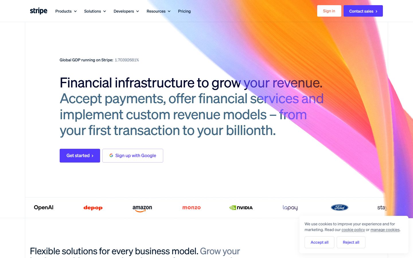
- H1 headings
- 2
- Actions on the first screen
- 4
- Smallest text on phone
- 8px
Sharper language to try.
- The complete payments and financial infrastructure to scale your business
- Accept payments, manage subscriptions, and send payouts globally with one platform
- Global payment infrastructure — from your first transaction to your billionth
- Create free account
- Start accepting payments
- Open developer account
How the score adds up.
76 / 100| Signal | What the audit saw | Score | Weight |
|---|---|---|---|
| Headline | 8/10 | ×20 | |
| Offer | 9/10 | ×15 | |
| Call to action | 6/10 | ×15 | |
| Proof | 10/10 | ×10 | |
| Objections | 8/10 | ×10 | |
| Button on the first screen | first CTA at 519px | 10/10 | ×10 |
| Load speed | loaded in 5.7s | 4/10 | ×10 |
| Mobile layout | smallest text 8px | 0/10 | ×5 |
| Meta tags | title 54 chars, description 148 chars | 10/10 | ×5 |
Measured in a real browser.
| Fully loaded | 5.7 s | ||
|---|---|---|---|
| First paint | 3.604 s | ||
| Page weight | 2,895 KB | ||
| Requests | 216 | ||
| H1 headings | 2 | ||
| Title | 54 characters | ||
| Description | 148 characters | ||
| Images without alt | 0 of 38 | ||
| Forms on the page | 0, 0 fields | ||
| Horizontal scroll on phone | no | ||
| Smallest text on phone | 8px | ||
Take the whole fix into your AI tool.
One prompt with every quote, replacement, and measured issue from this report — ready to paste beside the codebase.
Open the complete prompt
You are editing the landing page at https://stripe.com/

It scored 76 out of 100 (good) in a conversion audit.
The single most important fix: Fix the contrast overlap on mobile hero text and replace vague CTA button copy like 'Get started' with clear account creation language.

## Copy problems (4)

### 1. Call to action
Current text: "Get started"
Problem: The primary hero button text is vague and doesn't explicitly inform the user that they are creating an account.
Replace with: "Create free account"

### 2. Headline
Current text: "Financial infrastructure to grow your revenue."
Problem: On mobile viewports, the visual gradient background bleeds directly behind the words 'frastructure' and 'revenue', creating severe contrast issues and hurting legibility.
Replace with: "Financial infrastructure to scale your revenue"

### 3. Call to action
Current text: "Start now"
Problem: The bottom CTA button uses generic, low-intent phrasing.
Replace with: "Create account"

### 4. Objections
Current text: "See what you'll pay"
Problem: The pricing section hides standard transaction rates behind a click instead of addressing base cost expectations upfront.
Replace with: "See pricing — standard rates from 2.9% + 30¢ per charge"

## Technical problems (2)

- Load speed: loaded in 5.7s
- Mobile layout: smallest text 8px

## Approved headline options
- "The complete payments and financial infrastructure to scale your business"
- "Accept payments, manage subscriptions, and send payouts globally with one platform"
- "Global payment infrastructure — from your first transaction to your billionth"

## Approved button text options
- "Create free account"
- "Start accepting payments"
- "Open developer account"

## Rules
- Find the quoted text in the page source and replace it.
- Keep the surrounding markup, classes, and layout intact unless the fix requires a change.
- If the quoted text appears more than once, update every instance.
- If you cannot find the quoted text, say so instead of guessing.
- Work through the copy problems in the order listed — they are ordered by impact.
Run this on your own page.
One URL. Forty seconds. The same evidence you just read.